Colour your world: Even your left eye sees differently to your right

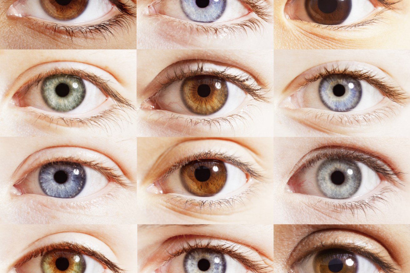
The density and arrangement of rods in our eyes is not identical, and this is partly why we see colours differently - but mostly it's the brain. Photo: Getty
Most of the 2000 people who took an online colour vision test – posted by a UK contact lens retailer – only managed to get six out of 10 questions correct.
And only one in 100 people scored 10 out of 10. Those high achievers tended to be aged between 31 and 35, while people in their 80s on average struggled to get four out of 10.
So in perceiving shades of colour correctly, age is a factor.
The test involved picking the lighter shades of blue or orange, or matching shades of pink, from a circle cut into quarters.
Other tests involved ordering blocks of blues, greens and reds from darker to lighter.
Then there was the classic test of defining a number or letter in a field of coloured dots.
It’s worth noting that when this writer took the test multiple times, with a break of at least an hour, instead of improving, new mistakes were made every time.
But most interesting is how the test – and how the majority of people scraped by with a pass – illustrates how the perception of colour is inherently prone to error, or at least a broad range of experience.

Part of the online colour vision test in which most people scored a humble 60 per cent. Here participants were meant to choose the best shade of green. Image: Lenstore
The most notorious example was the 2015 blue dress/gold dress argument that split the internet into two raucous camps – and led to several academic studies that tried to solve the problem.
Why did some people swear black and blue that the dress was … black and blue? And why did others vow on the eyes of their children that the dress was gold and white?
How on earth could people see two different things entirely? It brought the idea of relative perception to uncanny reality. And if you aspired to be on the “winning side”, what would it be?
In an MIT study, 1401 people – 313 of them had never seen “the dress” before – were asked what colour they thought it was. Results: 57 per cent said the dress was blue/black, 30 per cent said white/gold, 11 per cent saw blue/brown and 2 per cent something else entirely.

The blue dress/gold dress argument. How people saw the dress was determined by what time of day they believed it to have been photographed. The brain filtered out or ignored cooler or warmer colours based on what the viewer believed. Photo: The Conversation
The short answer: How you saw the dress was determined by how your brain perceived colours in daylight, and the assumptions people made about what time of day the dress was photographed.
For example, if they assumed the dress had been photographed in the middle of the day, their brain ignored bluer, shorter wavelengths.
Or as a joint study by German and British researchers concluded: When the dress colour was a certain brightness, their study subjects participants saw it was “white,” and when it was below that brightness, they called it “blue”.
But there are structural differences that affect how we perceive colour – to the extent that one eye will subtly see the world warmer or cooler than the other. This is because the arrangement and density of rods in our eyes – rods being the receptors that respond to different wavelengths or colours – aren’t identical.
If you, an individual, see the world differently from the left or right eye, it’s not surprising that a crowd of people, with their own arrangement of rods, will also see colours a little differently from one another – but not too differently, at least most of the time.

Images of living human retinas showing the wide diversity of number of cones sensitive to different colours. Photo: University of Rochester
But again it’s the brain that rules how we perceive colour. This was all but proven in 2005, when researchers at the University of Rochester found that the number of colour-sensitive cones in the human retina differs dramatically among people – by up to 40 times – yet people appear to perceive colours the same way.
Except when there’s an ambiguity of the sort that caused the dress debate, most of us broadly see the colour red in rose petals or on the lips of a fashion model.
That is, we know what the other fellow is talking about when he says “what a lovely red” – enough to avoid an argument, but not enough to know for sure we’re seeing exactly the same thing.
And most probably we’re not.

The Cheap Seats returns to tell quirkiest stories


AFI achievement award overwhelms Kidman


AI images proliferate with scammers, spammers