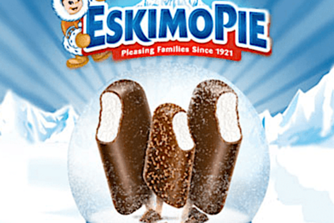
Racial stereotyping leaves Eskimo Pies out in the cold


The cliched image of a happy little Eskimo will melt away for good. Photo: Dreyer's
The owner of Eskimo Pie is changing its name and marketing of the nearly century-old chocolate-covered ice cream bar, the latest brand to reckon with racially charged logos and marketing.
“We are committed to being a part of the solution on racial equality, and recognise the term is derogatory,” said Elizabell Marquez, head of marketing for its parent Dreyer’s Grand Ice Cream, the US subsidiary for Froneri, in a statement.
“This move is part of a larger review to ensure our company and brands reflect our people values.”
The treat was patented by Christian Kent Nelson of Ohio and his business partner, Russell C Stover, in 1922, according to Smithsonian Magazine.
The first Europeans to visit the Arctic called the indigenous inhabitants “Esquimaux”, which evolved into “Eskimo” – nothing like what the First Nation people called themselves: Inuit.
Eskimo Pies join a growing list of brands that are rethinking their marketing in the wake of the Black Lives Matter protests in recent weeks triggered by the death of George Floyd.
Quaker Oats announced Wednesday that it will retire the Aunt Jemima brand, saying the company recognises the character’s origins are “based on a racial stereotype”.

Mrs Butterworth’s packing evokes racial imagery, critics say. Photo: Conagra
Other companies are reviewing their name or logo. Geechie Boy Mill, a family-owned operation in South Carolina that makes locally-grown and milled white grits, said Wednesday it is “listening and reviewing our overall branding,” though no decisions have been made.
Geechie is a dialect spoken mainly by the descendants of African-American slaves who settled on the Ogeechee River in Georgia, according to Merriam-Webster.com.
Mars Inc said it’s also reviewing its Uncle Ben’s rice brand. B&G Foods Inc., which makes Cream of Wheat hot cereal, also said this past week it is initiating “an immediate review” of its packaging. A smiling black chef holding a bowl of cereal has appeared on Cream of Wheat packaging and in ads since at least 1918, according to the company’s website.
Chicago-based Conagra Brands, which makes Mrs Butterworth’s syrup, said its bottles – which are shaped like a matronly woman – are intended to evoke a “loving grandmother”.
But the company said it can understand that the packaging could be misinterpreted. Critics have long claimed that the bottle’s design is rooted in the “mammy” stereotype.
-with AAP


