Donald Trump dumps ‘phallic’ campaign logo
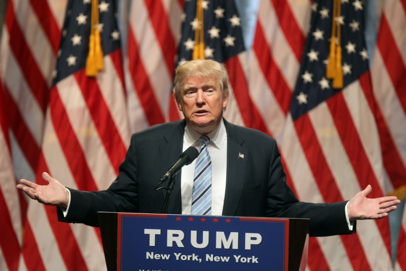
Getty
Donald Trump has been forced to remove his new United States presidential campaign logo after it was derided for looking too “phallic”.
The presumptive Republican US presidential candidate released the logo on Saturday (AEST) as he officially announced Mike Pence as his vice-presidential running mate.
Designed to represent their partnership, the joint campaign image depicted the “T” from Trump and the “P” from Pence interconnected. The phrase “Trump Pence: Make America great again”, was written below.
• Trump names running mate
• Why Islamic State hates France
• High-speed rail on a slow track
However thousands judged that the logo looked as if the “T” was having sex with the “P”. So many people shared this view that the logo was dumped soon after its release.
“This logo accurately represents what Trump Pence will do to America,” US Senate candidate Alan Grayson joked on Twitter..
Twitter user @DrYakubPhD wrote: “We all saw it, and it will never be unseen”.
Here is the “phallic” logo:
You wanna come over and Trump logo? pic.twitter.com/W0ByhULRGh
— Troy Johnson (@_troyjohnson) July 16, 2016
Which someone then made into a GIF:
A little humour. The official Trump Pence logo, animated pic.twitter.com/lpFbInFphv
— Mathieu von Rohr (@mathieuvonrohr) July 16, 2016
Mr Trump formally announced Mr Pence as his vice-presidential running mate in a joint appearance on Saturday.
He described the conservative Indiana Governor as a job creator and budget balancer who would help unify the Republican Party.
Mr Pence has been a strong advocate in the fight to de-fund Planned Parenthood family planning clinics, and he passed Indiana’s anti-abortion law this year.
The original logo did not appear in the joint conference. It was replaced with a different design, which has since reappeared on Mr Trump’s website since the “phallic” logo was removed.
The new logo is the same as the “phallic” one, but without the image of the T and the P locked into one another.
‘Phallic’ logo replaced with this:

The logo has been replaced by this less suggestive one. Photo: donaldjtrump.org
The original logo initially appeared on the letterhead of a fundraising email sent following Mr Pence’s unveiling.
Its symbolism was quickly picked up by social media users and mainstream US news outlets like CNN, USA Today and the Washington Post.
Mr Trump’s race for the White House has been riddled with controversies. He has crudely mocked a reporter for his disability, labelled a female reporter a “bimbo” and has openly made calls to ban all Islamic immigration to the US.
Despite controversy being the norm for Mr Trump, social media took great pleasure in mocking this more light-hearted incident.
#TrumpPence logo design test:
Is it memorable? A
Will it embroider? B-
Does it not look unintentionally sexual? …D pic.twitter.com/ualLBqPJF2— Adam Tiouririne (@Tiouririne) July 15, 2016
in case any news outlets want to use the Trump-Pence logo, i made it safe for TV pic.twitter.com/mxozHMzam6
— Matt Negrin (@MattNegrin) July 15, 2016
In about 9 months from today, the #TrumpPence logo will welcome a baby logo
— Brian (@Principat0) July 15, 2016
The #TrumpPence “T-banging-P” logo didn’t even last as long as the average Kardashian marriage.
— Jake Vig (@Jake_Vig) July 17, 2016
I spent 30 seconds and made @realDonaldTrump and @mike_pence a better logo in MS Paint. You’re welcome. #TrumpPence pic.twitter.com/qF7EyRL1N4
— Matt Walker (@funnymatt) July 15, 2016
TrumpPence logo by the legendary Scots graphic design duo Ben Doone and Phil McCavity
— William Gibson (@GreatDismal) July 15, 2016
I preferred the original #TrumpPence logo tbh pic.twitter.com/ogoOPyfzpw
— Reid Parker (@ReidParker_) July 15, 2016
– with ABC
