Map of the Week: The global inequality of life expectancy


This map reveals as much by what it is shows than by what it does not show. Photo: TND/MapPorn
Your friendly neighbourhood Stats Guy is on parental leave for the next ten weeks. So instead of a weekly data-driven column I am going to share some of my all-time favourite maps with you week after week.
This global map tells a decidedly local story for us Australians.
The map reveals as much by what it is shows than by what it does not show. We are seeing the largest sub-national regions (states) by life expectancy. Dark green means people on average life over the age of 80. Light green means people die between their 79th and 80th birthday.
We immediately notice that poorer regions are completely missing on this map. Africa is nowhere to be seen. Asia isn’t very present either.
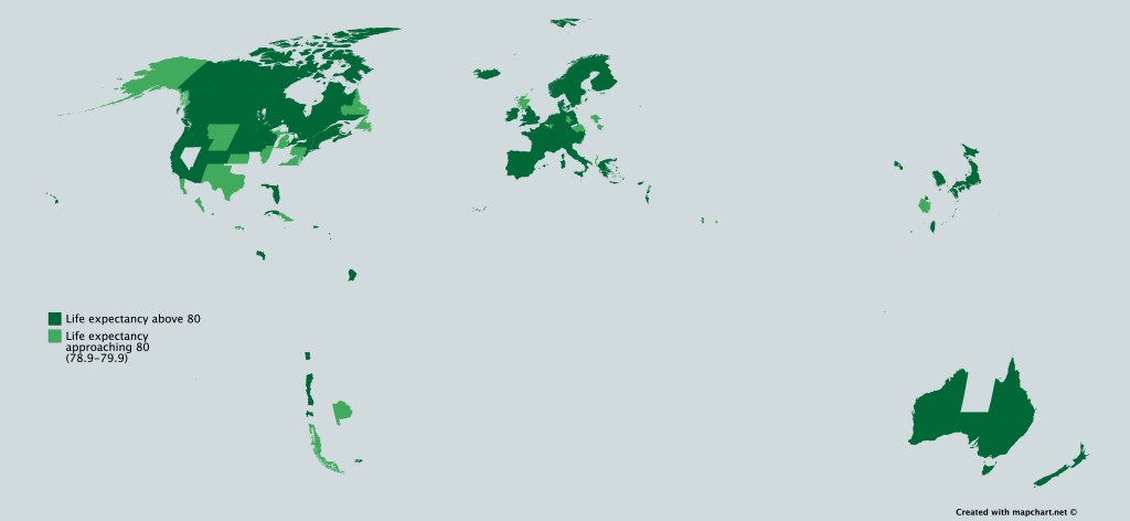
Subnational divisions with a Life Expectancy above 80. Source: MapPorn
Closer to home we see that only the Northern Territory is missing on this map. We can actually see the gap in indigenous and non-indigenous life expectancy on a world map. A similar narrative plays out in the US.
Demographer Simon Kuestenmacher is a co-founder of The Demographics Group. His columns, media commentary and public speaking focus on current socio-demographic trends and how these impact Australia. His latest book aims to awaken the love of maps and data in young readers. Follow Simon on Twitter (X), Facebook, LinkedIn for daily data insights in short format.
Want to see more stories from The New Daily in your Google search results?
- Click here to set The New Daily as a preferred source.
- Tick the box next to "The New Daily". That's it.