Beyond the pale: Why bright colours might be just what your house needs

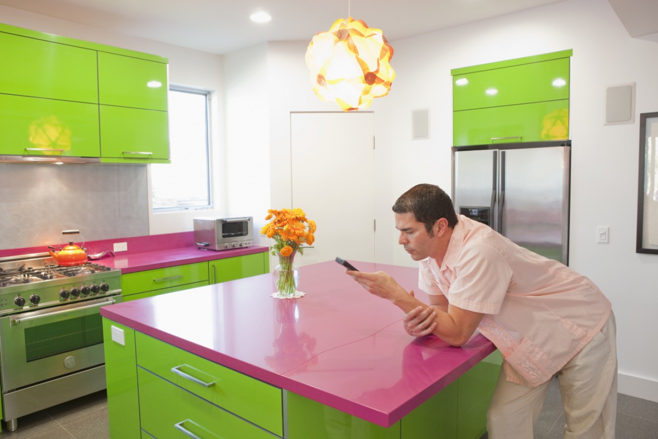
It's certainly bright and colourful, but this quirky kitchen won't be to everyone's taste. Photo: Getty
Katie M had already had a pale blue kitchen – in “matt not gloss” – made just for her, thanks to her carpenter husband. But when the chance arose for a revamp, she decided to ditch it and go even bolder in her colour choices.
The new cupboards are a dirty grey up top and lemon yellow below. They sit alongside a shelf that’s “almost chartreuse”.
Katie’s house once had more yellow in the courtyard tiles, along with grey, aubergine, red, blue, green and black. That area has since had a makeover and is now plain grey as, even for Katie (who wants her surname withheld), “it was too colourful”.
“You couldn’t put anything in there,” she said.
But her boldest move was not with colour but with space. She and her husband sliced off part of their second bedroom to build a large garage for his work tools. In the rest of the house, Katie bypassed the dominant open-plan aesthetic in favour of airy yet defined spaces.
Her house is what Melbourne real estate agent Arch Staver would call “bespoke” because, just as old houses are now described as “period”, individual or quirky ones have also had a rebrand.
Mr Staver, who has years of experience selling property in Melbourne’s trendy inner-north, is generally a fan of neutral colour schemes – the ever popular antique white, for example. He acknowledges, however, there is a market for bolder palettes.
“But it must be absolutely on-trend,” he said.
He points to coloured glass splashbacks as an example. Only a few years ago they were everywhere in lipstick red or grass green, but “people don’t want them now”.
In terms of other decorating sins, he will never forget the gigantic spa bath on a backyard terrace at one house: “It was OK if you were Hugh Hefner.”
Mr Staver said vendors were usually willing to go to considerable trouble to make a property more saleable – renovating to remove an offending spa bath, for instance.
“You don’t want buyers going ‘what atrocity has occurred here?’,” he said.
In addition to countless Victorian and Edwardian houses, Mr Staver has sold some designed or renovated by architect Andrew Maynard that in “a very strong architectural style”. One was a double-storey timber box-like addition, with a narrow window rising through both levels. It’s not for everybody.
“Those who recognise his vision absolutely love it,” he said.
“Strong architecture does that. But you get the yays and the nays.”
Around the corner from Katie, her long-time friend, Michael M (who also wants his surname withheld) has taken a different approach. But his styling is just as individual.
A fan of period architecture and member of the National Trust, Michael was keen to keep the floor plan in his two-storey Victorian terrace house as traditional as possible.
When renovating, he retained his galley kitchen and added a small sitting room, keeping a window to the dining room and preserving his garden – and opting against the oft-favoured full-width living zone.
The colours throughout are period, and are surprisingly strong. The bedroom is Province Blue, the living room is a jade-tinged Half-Strength Georgian Blue, another bedroom is leaf green and the bathroom is fully tiled in navy blue for no other reason than it reminded Michael of the bathroom in his childhood home.
“I’ve agonised over my choices,” he said.
“But I don’t think my tastes are outrageous. White and grey are too bland and dreary”.

The turquoise living room in Michael’s heritage house – “I don’t think my tastes are outrageous,” he says. Photo: Deirdre Smith
Michael’s renovation has been a long-term project and he acknowledges that “it’s not going to appeal to everybody”.
“I definitely did it for myself, they’re just colours I like,” he said.
David Oster is another Melbourne real estate agent, with 25 years’ experience in the city’s affluent eastern suburbs. He thinks sellers take a risk when putting a property with a strong personal stamp on the market.
“It can be quite polarising,” he said.
“It’s harder to sell unless you find the buyer who absolutely loves it.”
A veteran of thousands of house sales, Mr Oster has seen all the paint schemes, from sage to yellow and blue. His advice to buyers who might object to a particular palette is to “just paint it”, but he says most people can’t see past it.
He cites a house in leafy Hawthorn that had ornate painted period details “but it’s not fashionable now”. The multicoloured scheme remained in the formal rooms, but Mr Oster advised the vendor to paint the rest of the house off-white.
Offering such advice can be difficult for an agent. It’s their job to get the best price possible for the property, but well-meant suggestions can come at the cost of offending a client. Delicacy is required.
“It can be difficult to bring it up but when it’s a choice between what they love and greed, most people go for greed,” Mr Oster said.
Katie knows all this but she’s happy with her vibrant colour choices. For her, part of the appeal of yellow in her kitchen was to bring some brightness to a dark area, “otherwise it would be quite boring”.
“It has a lovely sunny glow to it,” she said. “A lot of people say ‘I don’t like yellow’ but it’s what everybody remembers.”
